










Last updated: August 20, 2026
Chanel and Dior have both put newsprint back on the runway this year, and the fashion press has started calling it a Y2K revival. That framing undersells what is actually interesting about the print. It has surfaced twice before this century, in two very different decades, and both times the reason had less to do with nostalgia than with what a printed page does to a garment: it turns something flat and disposable into a surface with real structure.
Elsa Schiaparelli made that argument first, in 1935. On a trip to Copenhagen she watched fishwives wearing newspaper twisted into makeshift hats against the cold, and turned the idea into a textile: a collage of her own press clippings, printed onto fabric and cut into blouses, scarves, and swimwear she later called, in her memoir Shocking Life, "bathing nonsense." It is generally credited as the first newspaper print made for clothing, and it reads less like a costume joke than an early case for text as raw material. Stripped of meaning and viewed only as pattern, it holds up as fabric in a way almost nothing else printed does.

John Galliano picked the idea back up sixty-five years later at Dior, for the label's autumn/winter 2000 ready-to-wear show, with a fictional broadsheet printed for the occasion, The Christian Dior Daily, run across chiffon, leather, and the reverse side of fur. The dress became one of the most photographed pieces of the early 2000s once Sarah Jessica Parker wore a version of it as Carrie Bradshaw in the third season of Sex and the City, and the association held on long enough that the print is still shorthand for that exact moment in fashion, a quarter century later.
What Chanel and Dior are doing with it now is not a costume reference to either of those two moments. It is a return to the print's actual mechanics. Text, set dense and small, reads at a distance as texture rather than language, and a garment built from that texture gets its entire visual argument from contrast and repetition rather than color. The print has never really worked in anything but black and white, and that is not an aesthetic accident. Color would give the eye something else to read, and the whole point is that there is not one.
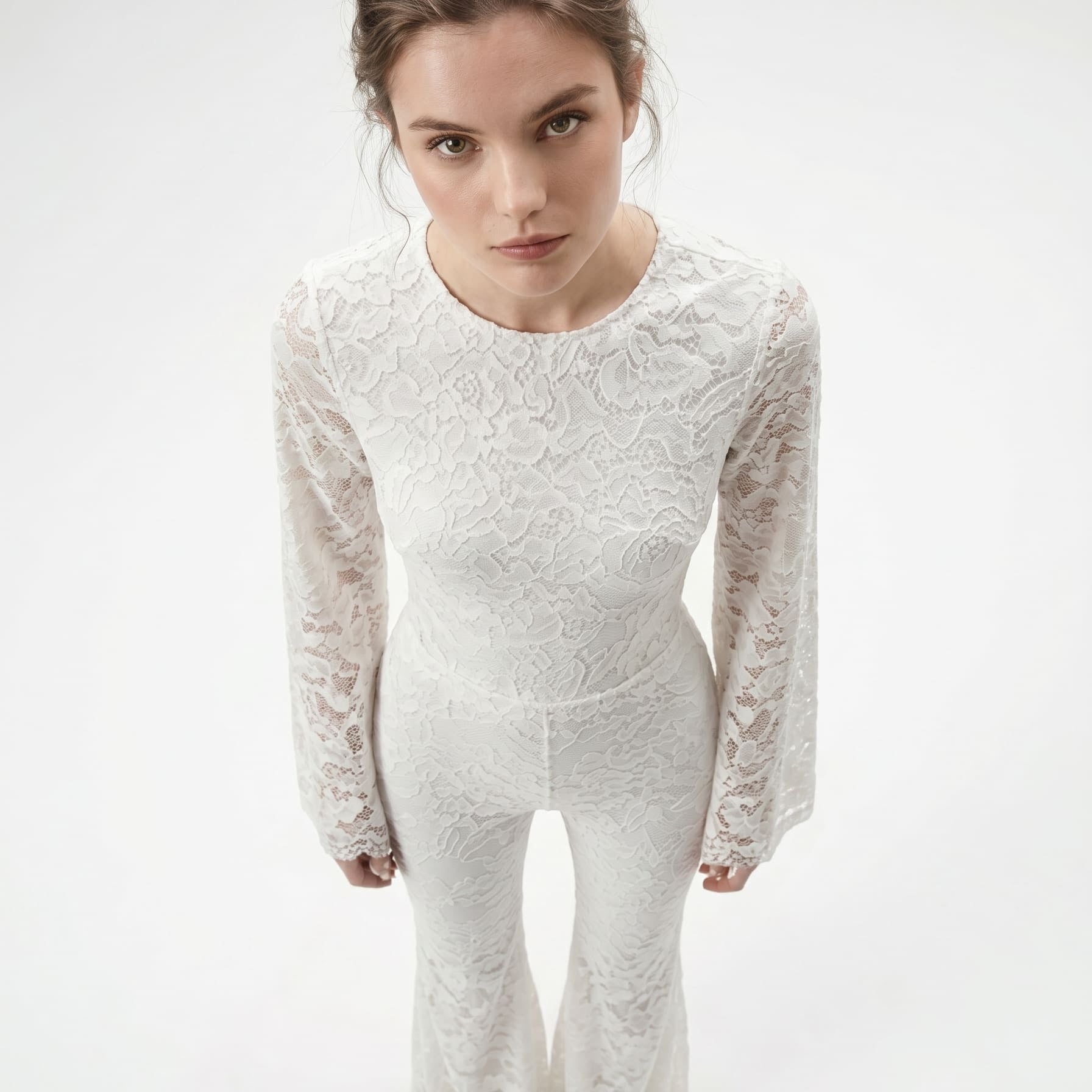
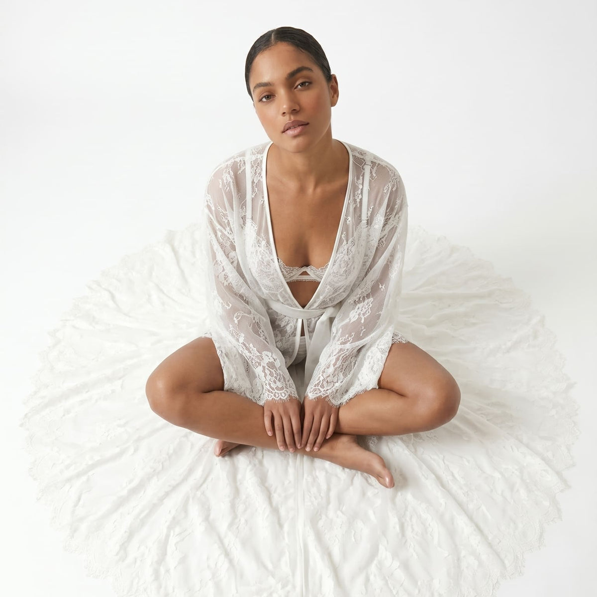
That is the same argument behind our own Black Flowers pieces, even though nothing about them is printed. The pattern is built from actual lace, hand-tailored rather than run through a press, but the logic is identical: a dense, dark motif set against sheer mesh, with no color doing any of the work. Up close it reads as ornament. At a small distance it reads as pure shadow, the same trick a page of newsprint pulls once it is cut into a dress.

Twenty-five years is a long gap between a garment's first cultural moment and its second. In both 1935 and 2000, the print was not decoration laid over a plain dress. It was the structural idea the whole garment was cut around. That is the part of the current revival worth paying attention to, more than the ink itself.
Atelier Notes is where the Lioness team writes about the wider fashion and lingerie industry: runway moments, craftsmanship stories, and the ideas moving through fashion that connect back to how we build our own pieces. Separate voice from the Lioness Studio guides, same team behind it.